Showing posts with label Adobe. Show all posts

Wednesday, September 29, 2010

Before & After, Episode 17

Here’s another great example of the sheer power of Photoshop, and a case where a little bit of forward thinking on my part really paid dividends once the shooting was complete.  If you’re a regular reader of my blog, then you already know that when I’m commissioned to produce promo images for a band, I almost always shoot each band member separately in the studio.  It allows me to work within the confines of my relatively small studio space, and affords me much greater latitude in post-production.  But here’s a case where I took things a step further….

LIGHTING
When I was originally planning this shot, I decided that it might look really nice if there were a gorgeous sunset behind the band, and I knew I could accomplish this later in Photoshop with a reasonable amount of effort.  However, I also knew that folks with sunsets at their backs tend to have an orange “rim light” that appears along the edges of their clothing and hair, and this, on the other hand, is *extremely* difficult to simulate in Photoshop.  So I knew that I’d have to find some way to produce an orange rim light around each person in order for the final composite to be believable.  As you’ll see from the “before” shots, I accomplished this by placing a strobe behind each person….but the key is that I placed a full CTO gel onto each strobe to color the light orange.  If you look closely, you can see that this does in fact give the resulting light the appearance of a sunset.

POST-PRODUCTION
Using Photoshop CS5’s new Refine Edge tool (which, by the way, is an absolute godsend for digital compositors— I hardly ever have to rely on channel masks anymore), I extracted each band member from their respective original shot, and placed them all into a new blank document.  I then dropped in a new sky with a nice glowing sunset, and proceeded to really increase the light intensity in the sun area by applying a Levels adjustment with a radial gradient mask.  I also increased the lightness levels along the sides of the two band members’ faces who are standing right in front of the sun.  Next I added an artificial lens flare to really drive home the effect.  I also had to add a couple of shadows, since band members standing that close to one another would undoubtedly cast a shadow on the adjacent person.  I dropped the exposure of the bottom quarter of the image to draw the viewer's eyes upward where they need to be.  There were LOTS of local contrast adjustments along with the usual dodging and burning, and finally I introduced a slight orange color cast to the entire image with a warming photo filter.


Here are the before shots. Notice the light stand on the floor behind each band member (with the full CTO gel, as previously discussed).

individual band members


And here is the final composite, complete with all of the adjustments mentioned above:

Tampa band promo glorysound

Your comments—good, bad, or indifferent—are always deeply appreciated.  And of course don’t forget to Like/Share!


Tuesday, June 1, 2010

An Exercise In Digital Compositing | WESLEY CHAPEL BAND PROMO PHOTOGRAPHER

What do you do if you've been asked to put together a promo shot for a band consisting of 4 members, and your studio space isn't quite big enough to pull it off?  Freak out and tell them you just can't do it?  Of course not......Photoshop to the rescue!

Not only does this method save you the hassle of trying to squeeze 4 people into a space that was really designed for a single model, but it also affords you quite a bit of flexibility in terms of shot selection.  In other words, you can mix and match the best individual shots to your heart's content in order to come up with the best overall composite.  So you basically don't have to worry about capturing good facial expressions on all 4 faces in a single frame.

Here are the 4 original SOOC shots:


Using Photoshop CS5's new masking tools, extracting a subject from a solid-color background has never been easier.  You just draw a rough selection around the subject with the Lasso tool, add a mask, and then use the Refine Edge dialog to decontaminate the excess color (in this case, white).  Then just take the individual shots that you want to composite together and drop them onto a large white canvas in Photoshop.

One last thing I had to do in this case was use the Free Transform tool to adjust each band member's size relative to the others.  In order to figure out who was taller than who in real life, I had to go back to a previous shot that I had done of this same band.  Of course I could have saved myself quite a bit of time by simply using a tripod and shooting each person from the exact same position and angle, but I'll just have to take that as a "note to self" for next time.  Anyway, here's the final composite:


Ever use this technique yourself?  Plan to use it in the future?  Please tell me about it in a comment below, and click "like" along the way!  :-)


Tuesday, May 25, 2010

Pic-A-Week, Episode 1 | NEW TAMPA SENIOR PORTRAIT PHOTOGRAPHER

Hello, loyal readers! Obviously I've been WAY delinquent in keeping up with my blog over the past month, so here's what I'm gonna do.....basically, I want to implement a few new ideas that will help me to establish a more regular posting schedule so that you guys can better stay in the loop with what I'm working on. One of these ideas is a "Pic-A-Week" concept that I gleaned from Richard Arsenault's blog. Rich has got some fantastic nature shots, so if you're into that sort of thing, then I recommend you take a peek at his work.

Anyway, for Episode 1 I'm gonna kick things off with an image that I shot a couple of weekends ago. Believe it or not, this was actually my very first high school senior session. Although I've had the pleasure of working with a good number of fashion/glamour clients thus far in my photographic journey, none of them have been seniors (or even high school-aged, for that matter). I consider senior portraits to be a natural extension of fashion & glamour, so it only makes sense that I would expand into this market eventually.

This image was shot on a white seamless paper backdrop, and all the other colors and embellishments that you see were added in post. If you'd like a more detailed description of how I accomplished this, please just let me know below, and I'd be happy to share my techniques with you. Otherwise, please leave me a comment below with your thoughts, and help me spread the word by clicking "Like" as well.  Thanks ya'll!

For more examples of my fashion, glamour, and beauty work, please visit my portfolio website at http://RussRobinsonPhotography.com.  


Tuesday, April 6, 2010

Before & After, Episode 11 | WESLEY CHAPEL SENIOR PORTRAIT PHOTOGRAPHER

This time around it's a double header, kiddies...so strap yourselves in and let's take a ride.  ;-)

The first image you'll already be familiar with, since I presented it in my last blog post.  I did receive a few questions from readers about the distracting background, and my response was that I simply wasn't shooting for portfolio images (and therefore didn't really care about it at the time).  However, I later realized that I had originally promised my "model" that he'd get a Facebook profile pic out of the deal, so off to Photoshop land I went....

I extracted him out of the original background using a tool called ReMask from Topaz Labs.  It's a fairly decent "quick and dirty" extraction tool when the item you're trying to extract has a fairly well-defined edge and there is clear separation from the background.  However, I wouldn't use it for anything too complex, because it starts to get a little squirrely with your edges, and you'll end up saying a few more curse words than you would if you had used a REAL extraction tool like Vertus Fluid Mask.  Anyway, I digress.

I found a nice stock image of a Nissan 350Z on Flickr (photo credit Jeremy Cliff), and decided it would make a much more appealing backdrop for my model, since he also happens to drive a 350Z.  I dropped him into the scene as a new layer, used the free transform tool (while holding the Shift key, which constrains the proportions) to adjust him down to a smaller size relative to the car, and proceeded to make all sorts of adjustments to the lighting.  That's the real key to making believable composites-- you absolutely *have* to pay very close attention to the lighting or it will scream "PHOTOSHOPPED!".

Anyway, when all was said and done there were a number of adjustment layers......mostly Curves and Levels with different masks applied, and also a couple of Dodge & Burn layers.  Sorry that I didn't take detailed notes of all the steps I took, or I would gladly share them with you.  I'm more than willing to answer any questions you may have about the process, though.  So here's the before & after image (roll over it with your mouse):


The second image was taken in my studio that same day, and basically he was laying on his belly with a Lastolite TriGrip Reflector under his elbows and a beauty dish above his head.  It was inspired by an image I had seen on legendary high school senior photographer Kirk Voclain's website a couple of months earlier.  As far as post processing:

  1. I cleaned up his skin a bit using the High Pass filter (here's an excellent tutorial on this technique)
  2. I added some additional contrast using another High Pass filter (again, here's a great site explaining 3 great uses for this filter)
  3. I enhanced the color of his eyes by creating a new layer, lassoing his irises with the elliptical marquee tool, filling the selection with a bright blue, changing the blend mode to Color, and reducing opacity to taste
  4. For the most dramatic change, I blended in a texture of a scratched surface, and masked out his eyes and most of his face with a reduced-opacity, soft brush.
  5. Lastly, I created a merged layer at the top of my stack (Ctrl+Alt+Shift+E) (or Cmd+Opt+Shift+E for Mac users), added a Gaussian Blur, then applied mask using the Gradient Tool in linear gradient mode so that only the top and bottom edges of the photo would be a little blurry.  Kind of gives the photo a little more interest, and helps to draw the viewer's eye to those of my model.
Check out the before and after below.  I think the image has much more drama and "punch" now, don't you?  Please let me know your thoughts by leaving a comment.  I absolutely LOVE hearing your feedback and all the many different fascinating perspectives you share with me.  It's what truly makes this all worthwhile.  Enjoy!


Monday, March 29, 2010

Photoshop CS5 & Content-Aware Fill | NEW TAMPA PHOTOSHOP RETOUCHER

In case you haven't heard, Photoshop CS5 (codename "White Rabbit") is right around the corner, and one of the hottest new features rumored to be included in this release is something called Content-Aware Fill (a.k.a. PatchMatch). I saw a demo of it during the keynote presentation at Photoshop World East in Orlando last week, and the crowd went wild. It's a truly remarkable innovation that will surely save photographers and designers boatloads of time. Check out the video HERE or by clicking the image below:


Sunday, March 28, 2010

Before & After, Episode 10 | NEW TAMPA BABY CHILD PHOTOGRAPHER

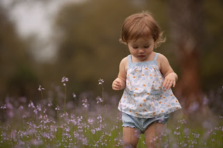
Here's a shot I grabbed of my daughter earlier today. Since you guys made it clear through your responses to my recent survey that you want more photography and post-processing tips, I decided to change things up this time around and include much more granular detail about how the shot was captured and my post-processing workflow for it. So here goes....

First of all, to get the shot, I was lying on my stomach near a patch of purple wildflowers we found down at a local park. I had my 70-200 2.8L lens mounted on my Canon 1Ds Mark II, and I was shooting wide open at 2.8, zoomed all the way in at 200mm. I asked my wife to call my daughter to walk through the flowers, and amazingly everything worked out just as I had envisioned it. I have to admit that it was a real treat to have my wife there assisting me, because when it comes to pics of my daughter I usually find myself in the unenviable position of trying to *create* the moments as well as *capture* them. Today I had the luxury of focusing on the technical stuff, and as a result the frames I got were MUCH better than usual.

Here's the SOOC (straight out of camera) image, which you can click for a larger view:


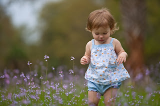
Next up was a bit of tweaking in Lightroom, which included adjusting the White Balance, adding a small amount of Fill Light, increasing the Blacks by 6, Clarity by 21, and Vibrance by 38. I also made some minor tweaks to the Tone Curve. Lastly, I used the Adjustment Brush to increase the exposure on her face just a tad. At this point I was ready to pull the file over into Photoshop. Here's what the image looked like with the Lightroom adjustments (click it for a larger view):


In Photoshop, below are the primary techniques I used to get the final product. There may have been a few very minor tweaks beyond what is listed here, but these are the steps I tend to include in most of my outdoor portraiture. By the way, I'm sure you've noticed that a good majority of pro photographers tend to shy away from revealing the "secret sauce" that makes their photos really pop. However, I really want to help you get to the next level with your post processing, so that's why I'm laying this out for everyone to see. As my photographer/idol Zack Arias recently told me at Photoshop World, "we all stand on each others' shoulders". So true, so true.

Oh yeah....if you're a Mac user, please substitute "Ctrl" for "Command" and "Alt" for "Option" (but you knew that already, right?) Anyway, here we go:

  1. To add a bit of contrast, create a Black & White adjustment layer, change the Blend Mode to Soft Light, adjust the color sliders to taste, and reduce layer opacity to around 20%.
  2. To add even more contrast, perform a "Stamp Visible" (which creates a flattened copy of all of your layers at the top of the stack) by pressing Ctrl+Alt+Shift+E. Apply a Gaussian Blur at 5 px, change the blend mode to Soft Light, and and reduce layer opacity to around 30%. Then mask out your subject (with a reduced opacity brush, if desired).
  3. To lighten the subject a little, and make him/her "pop" a little more off the background, perform a "Stamp Visible" by pressing Ctrl+Alt+Shift+E, desaturate this layer (Ctrl+Shift+U), change the Blend Mode to Screen, and reduce layer opacity to about 25-30%. Then mask out the background (or alternatively you can start with a black mask and reveal the subject with white).
  4. Add a bit of midtone contrast-- perform a "Stamp Visible" by pressing Ctrl+Alt+Shift+E, then apply an Unsharp Mask with Amount at 60%, Radius at 20 pixels, and Threshold at 0. Reduce layer opacity to around 30-35%.
  5. Get your colors nice and saturated by performing a "LAB Mode Color Pop". This basically involves flipping over into LAB Mode, creating a Curves adjustment layer, pulling the ends of the line in, and then flipping back into RGB mode. You end up with a super-saturated layer that you can adjust the opacity of, and/or mask out certain parts. You will almost always have to mask out your subject's skin, because it'll be a nasty orangish/reddish mess. There are actually many different methods for popping colors in LAB Mode....click here for 5 of them.
  6. Lastly, finish off with some High Pass sharpening-- perform a "Stamp Visible" by pressing Ctrl+Alt+Shift+E, then change the layer's blend mode to Soft Light. Go to Filter->Other->High Pass and set the radius to about 5 or 6 pixels. Then reduce the opacity of this layer to taste.
And that's pretty much all I did to this photo. As you'll see, I also decided to clone out the tree in the background, which I found to be very distracting, but the technique I used for that will have to wait for a different blog post. ;-)

So here's the final before & after image (roll your mouse cursor over the top to see the changes). Please let me know if you have any questions, and if you enjoyed this post, please comment below or on Facebook. Thanks!


Tuesday, March 23, 2010

What's New in Lightroom 3 Public Beta 2 | NEW TAMPA PHOTO RETOUCH

I must say that I'm super-excited about many of the changes being introduced in the latest version of Adobe Lightroom, the *premier* image editing/digital asset management program in use today. The most significant additions include: the ability to tag, preview and organize your video files right alongside your images, much better noise reduction capabilities (also, it's worth noting that Luminance noise reduction is finally working), better vignetting and watermarking options, and last but not least, built-in tethering capabilities. If you shoot tethered like me, this last one is a game-changer. Here's a fantastic video overview of the new features, created by Adobe Creative Suite guru Terry White.

With all the new improvements and additions being announced, I have to admit that I'm still stuck using Lightroom 2.6 because there is no direct upgrade path from this version to the new one. Adobe doesn't want to be held liable for corrupting people's primary Lightroom databases with beta software (understandably), and I haven't been willing (yet) to completely jump in with both feet and make the switch. However, I think I may install 3.0 B2 on my studio computer (which is the one I shoot tethered to), and then just import those images into the database on my main computer after each shoot. How about you? Have you played with 3.0 at all? I'd love to hear your thoughts/impressions.


About Me

My photo
Tampa, FL, United States
I'm a commercial photographer in Tampa, FL specializing in band & musician promos, CD covers, press kits, posters, and the like. Please feel free to check out my website/blog using the link below, and give me a shout if I can be of service to you!

http://TampaBandPhotos.com

Search My Blog

Followers